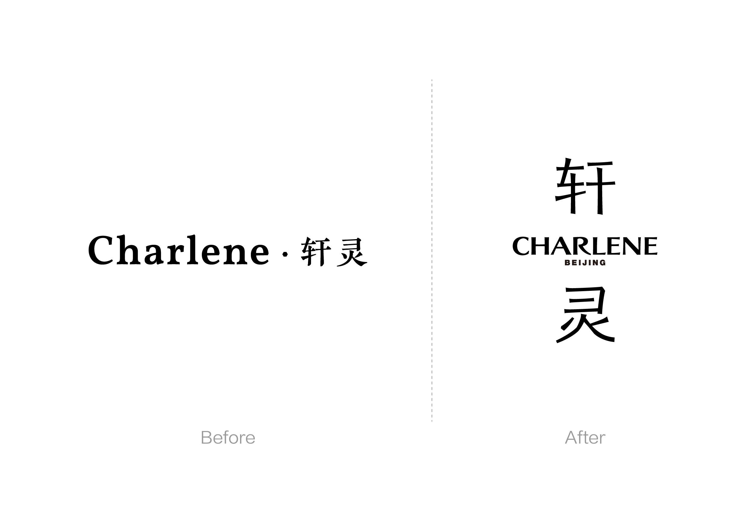
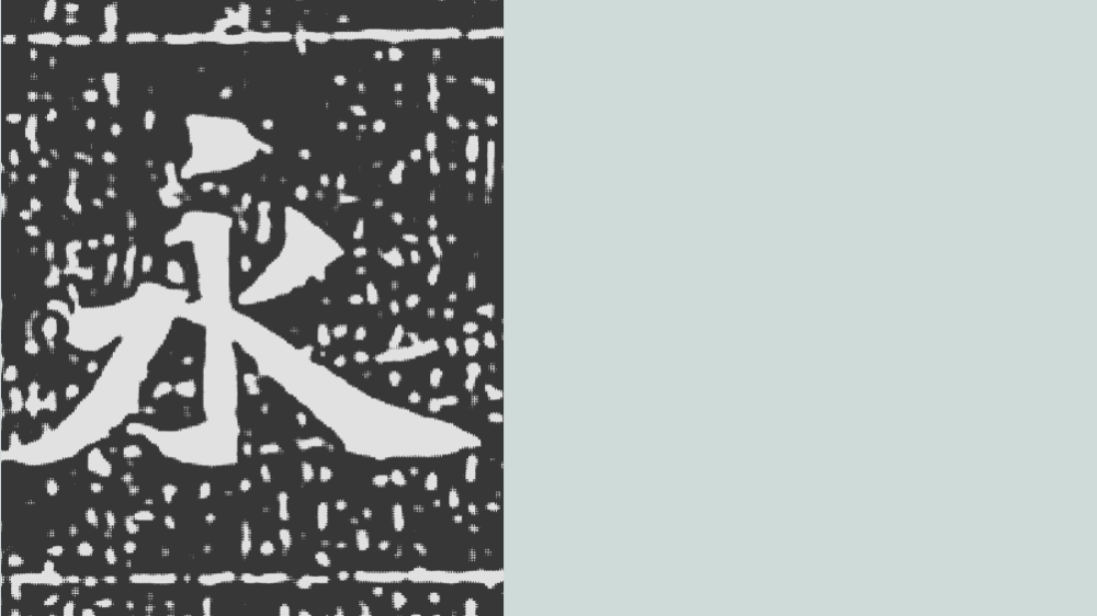
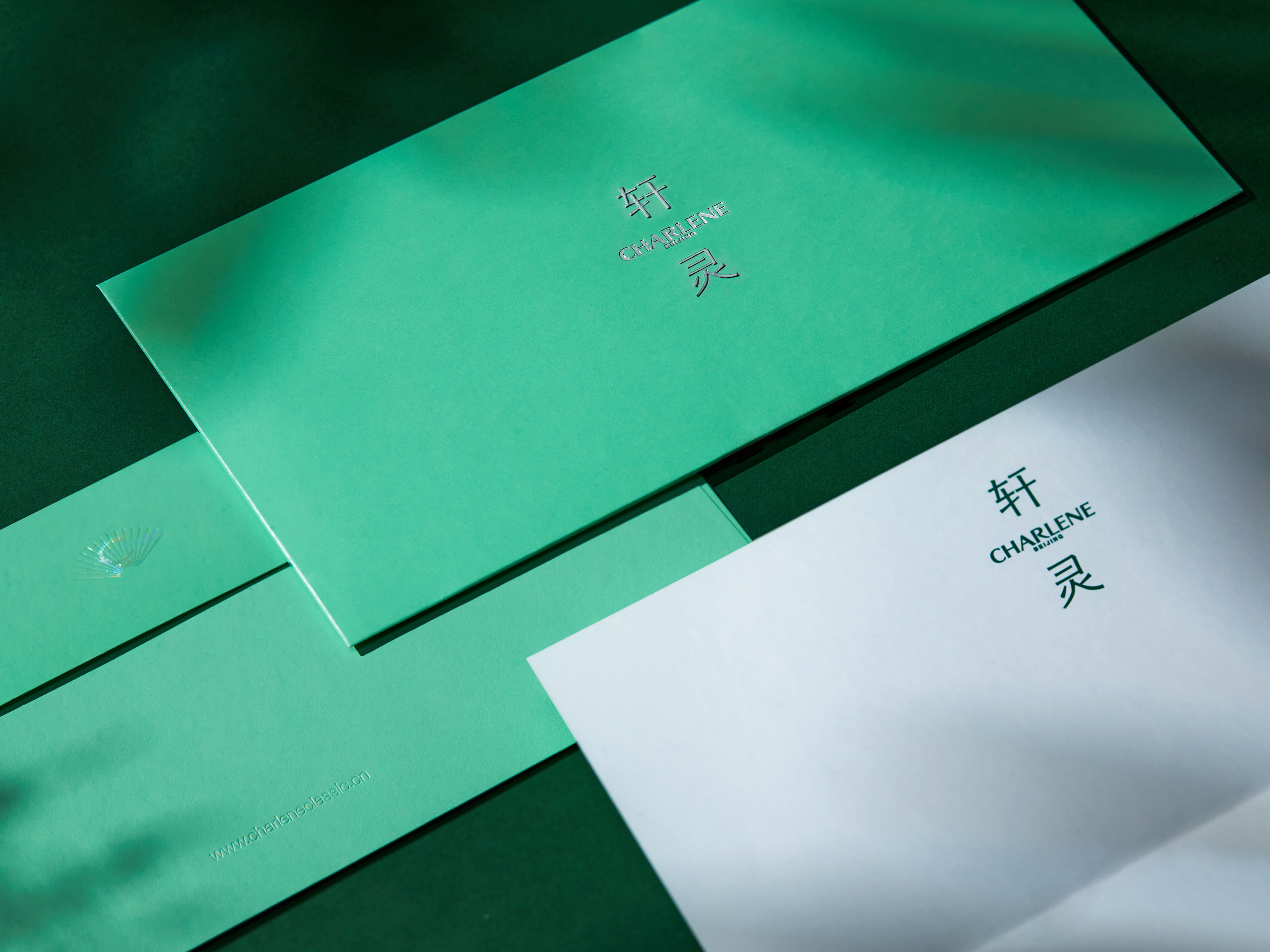
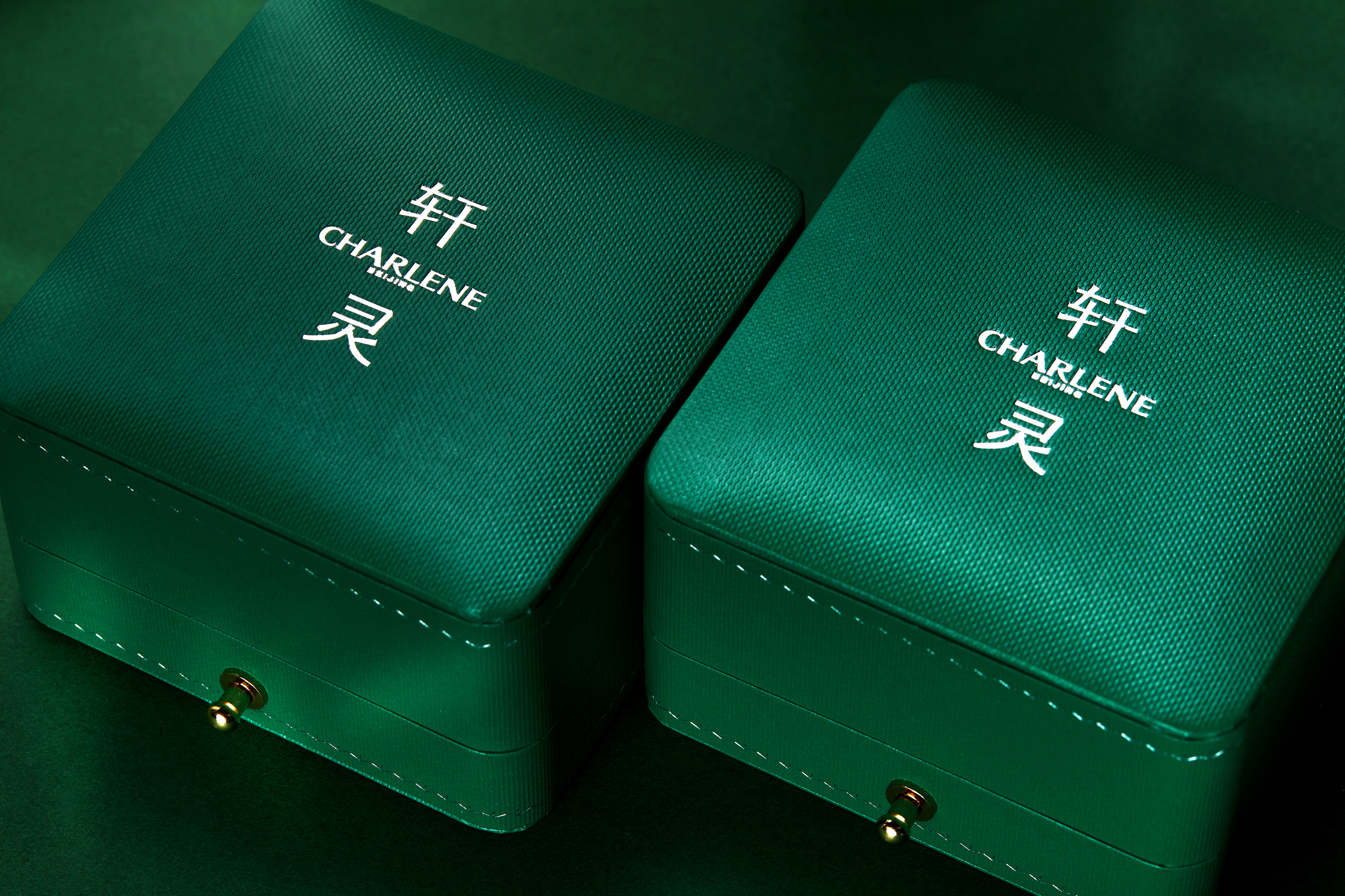
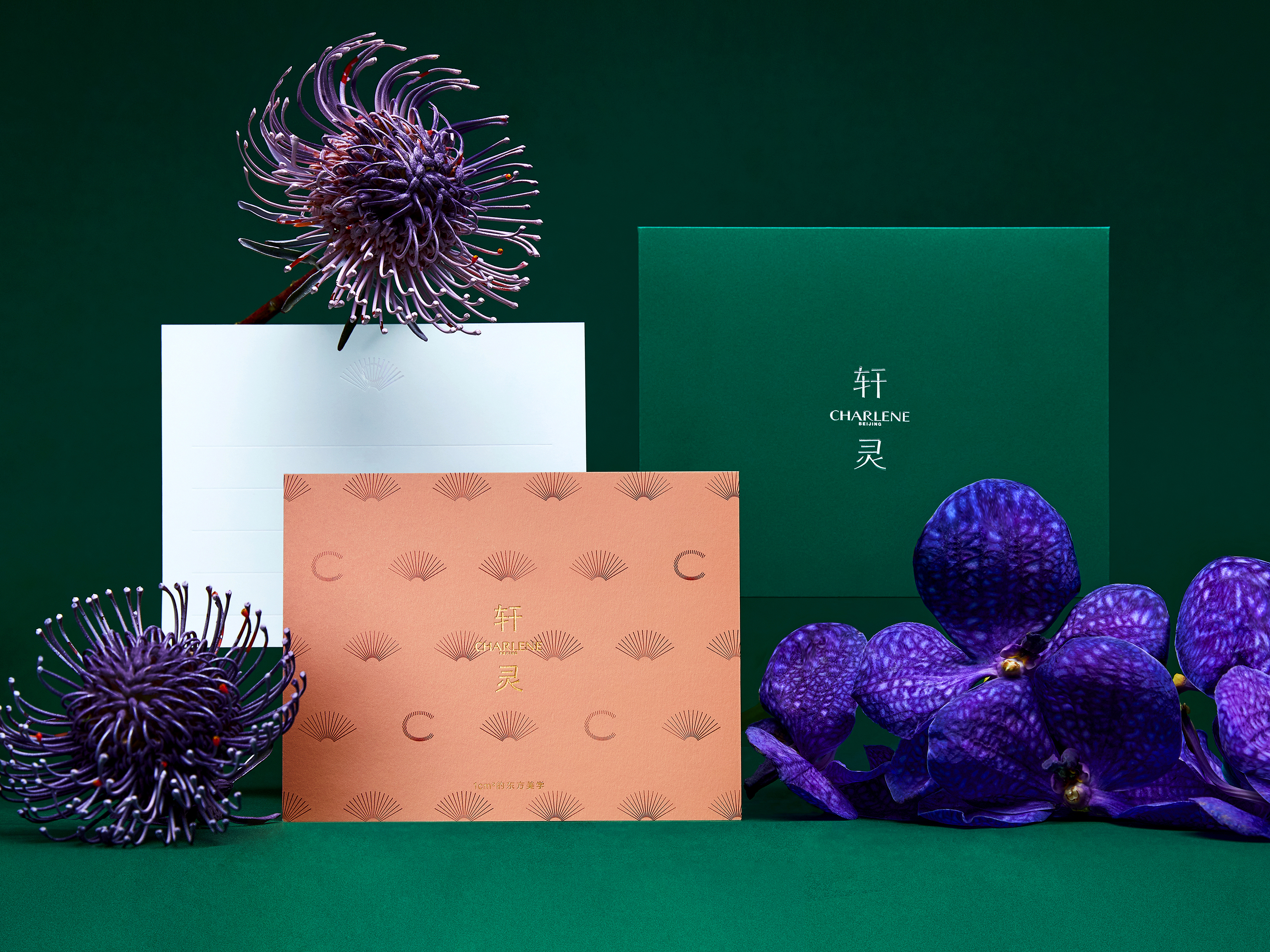
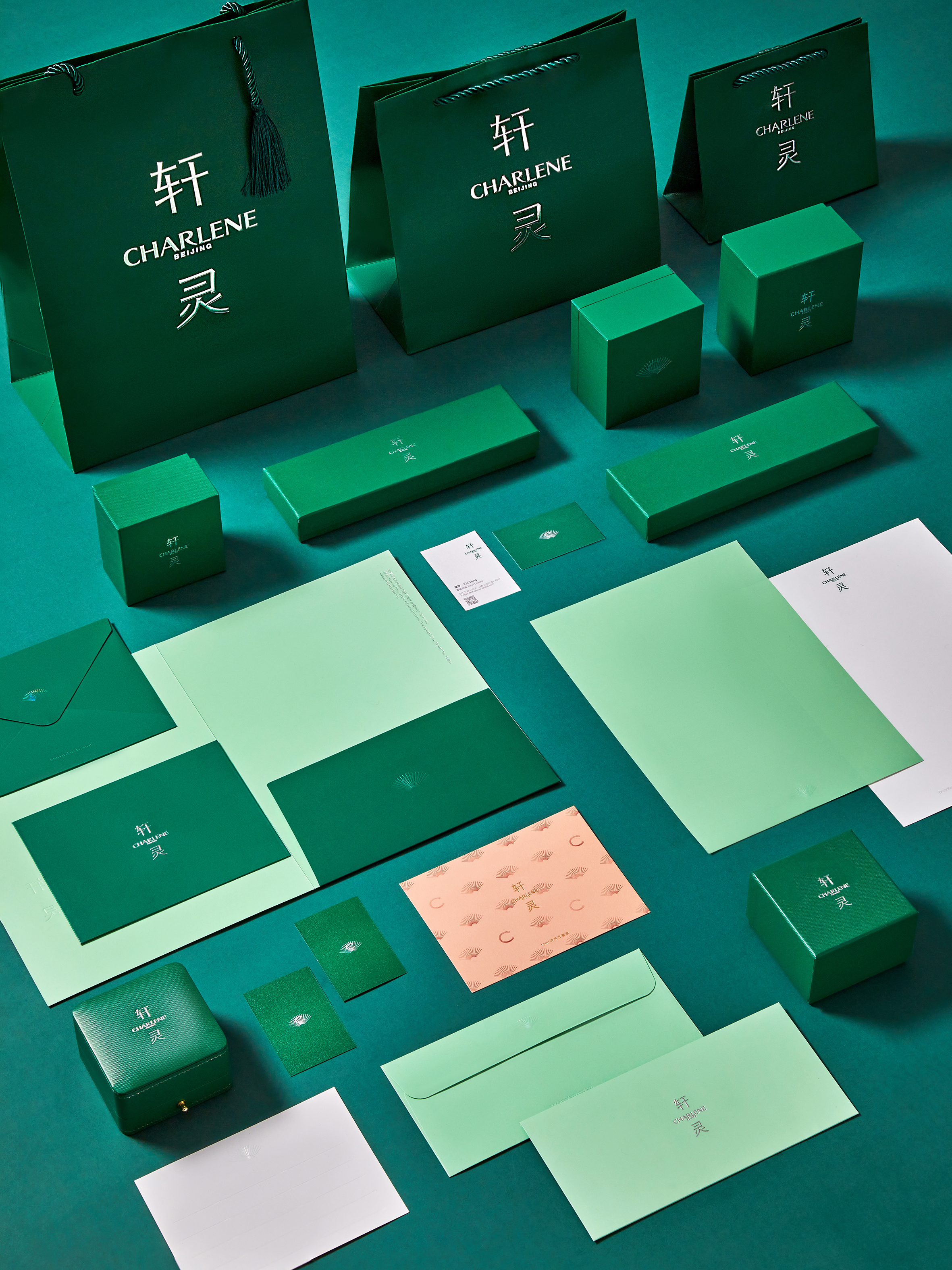
CHARLENE, established in 2013, is a high-end jewelry brand from Beijing. Charlene's jewelry designs often incorporate elements of Chinese local art and culture, giving them a refined, scholarly spirit. The core concept of the brand is defined as "One Square Centimeter of Oriental Aesthetics." Based on the existing brand tone and value advocacy, we use "Sculpting Time" as the fundamental concept. Starting from the brand's typeface, we draw inspiration from the features of WEI tablet script, integrating the instrumental and material nature of engraved characters—"knife" and "stone"—into the new brand typeface. This shapes a new brand image that is understated yet powerful, subtle yet rich, resonating with the jewelry design and creation process.
CHARLENE Rebranding
Art Director: Cen Liu, Song Qian
Designer: Cen Liu
Year: 2023
Client: CHARLENE
Art Director: Cen Liu, Song Qian
Designer: Cen Liu
Year: 2023
Client: CHARLENE